 The Total Link System Chart (TLSC) is a tool used by Toyota to show the multiple connections on the “when,” “why,” “how,” and “what”—not only of a production system but also in all business reforms at Toyota. While used often at Toyota, it is nearly unknown in the Western world. Time to look at the Total Link System Chart in more detail.
History
 The Total Link System Chart (in Japanese トータルリンクシステム図 or トータル・リング・システム・チャート) was developed at Toyota around 1980 with the focus on manufacturing. It was further refined around 1990 for use also in other divisions besides manufacturing. My former boss at Toyota, Masaru Nakano, was one of the drivers of this refinement.
Originally, these Total Link System Charts were made using paper and pencil, or on a whiteboard or a wall in a conference room. However, nowadays some companies utilize software packages for diagrams to create a digital version of the Total Link System Chart.
Goals
 The Total Link System Chart is used to improve business systems. While it started out for manufacturing systems, it has also been applied to the sales division, IT division, accounting division, etc. For this it is used within the Toyota group, like Toyota Motor and Denso. The Total Link System Chart has been employed by the Total Quality management (TQM) promotion center of Toyota.
As the tool evolved over time, many different variants came into use. All of them try to wrangle a complex network of information, combining a process flow with evaluations, goals, resources, and more depending on the use. As with most “tools” from Toyota, there is not one standard format, but everybody adjust and adapts the tools to fit their needs.
Example for Installing New Machines on Shop Floor
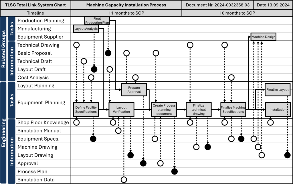
Below is an example Total Link System Chart for the process of installing a new machine or production system on the shop floor. This image and the next one are based on the paper “The explanation of “Toyota production system” and “Visualization” by Yoshito Fuji (source below).
The chart ties together a complex network of information. Central to this is the flowchart or swim lane diagram. The feature that distinguishes a swim lane diagram from a normal flow chart is the lanes in the diagram that represent different departments/functions/offices, etc. Since these lanes make the flow chart look like the lanes of a swimming pool, this type of diagram is often called a swim lane diagram (see my blog post All About Swim Lane Diagrams for more information). In this example, these are the tasks that the engineering department of this company has to do, divided into layout planning and equipment planning groups.
Above and below are two information sections. The bottom one is information created by the engineering group themselves. The upper one is information provided by other groups or departments. These other departments also get their own task section, albeit it is much less detailed than the tasks for the engineering group. This makes sense, as engineering doesn’t need to know how the production planning group makes its production plan; it only wants the production plan.
The information flow is visualized using dashed arrows starting or originating at a circle. Black-filled circles are where the information flows in. White circles are where the information flows out. This way, it’s easy to see where information comes from and where it is used again.
There is also a timeline showing how long before the start of production (SOP) each step should start. Finally, on the top is the usual header with title, document number, date, and so on.
Example for Job Hunting
The example below is based on a job-hunting process for a freshly graduated university student. It, too, has at its center the flow diagram. As the student is only one person, so it doesn’t have different swim lanes. But it does have the internal and external information above and below the flow diagram.
A Structured Overview
These are two examples of the Total Link System Chart. But they are by far not the only ones. Many of the Total Link System Charts have separate rows for information, with the black and white circles for information going in and out respectively. While this is often information, these circles are also sometimes used for things flowing in our out of the flowchart. Other examples do not have these circles at all, but are merely an arranged flow diagram.
Many Total Link System Charts aim to show you the how, when, why, and what. The “how” part describes a business process (i.e., the sequence of tasks needed for a process).
The “when” part is probably the least impressive addition, since it is simply the timeline of the swim lane diagram. You do the steps of the how in the sequence they appear from left to right.
More interesting is the “why” of the Total Link System Chart, which links the activities of the “how” and the “when” with the goals. This is drawn on top of the how and when area. Each goal gets a row, and wherever the “how” applies to a certain goal, a line is drawn with circles for the connections.
The “what” part represents the different objects. Often, but not always, these are information that is going in and out.
Again, there are many different ways to do a Total Link System Chart, and many people rearrange, modify, skip, or add elements to the chart. Quite a few Total Link System Charts, for example, do not use the white and black circles for information flowing in and out. As always at Toyota, make the tool fit your needs, not the other way round. Now, go out, get an overview of your business process, and organize your industry!
Selected Sources
- Masaru Nakano, “いま世界ではトヨタ生産方式がどのように進化しているか”, published by Nikkan Kogyo Shimbun ,2017, ISBN 978-4526077227.
- Yoshito Fuji “トヨタ生産方式”と“みえる化”の取り組みについて (The explanation of “Toyota production system” and “Visualization” ), ものつくり大学紀要 (Bulletin of the Institute of Monozukuri), pg. 84-87, 4 2013
PS: Many thanks to Prof. Nakano for sharing his information on the Total Link System Chart with me. One source was his book.
Discover more from AllAboutLean.com
Subscribe to get the latest posts sent to your email.


I need know more about this matter.
I think that the “When” is a lot more interesting than you are taking it to be. When I work with clients and create Swim-Lane process flow diagrams I always identify time horizons and specifically mark the time zones in ‘count-down’ nomenclature. An example using this case “Finalize Layout” would be t0 (imagine subscript). Then working backwards to the left, subsequently marking the time zones as t-10, t-12 (months in this case), etc. These ‘minus’ zones give me an effective lead and/or cycle time and provide insights into “Why” I am performing well or poorly in my process design. I am applying value-stream analysis combined with the swim-lane view.
I had never heard of the Total Link System Chart before. I knew Toyota was a lean company, well-known for its efficient systems, so learning about one of its powerful tools like this is informative and exciting. It’s interesting how this tool doesn’t have a set format and can be adapted and manipulated to fit different needs across many departments. I’m currently a supply chain management student at URI so learning about visualization tools like this is super helpful for understanding how I can make processes easier for other people to understand. Visualizing flows also makes developing systems and processes easier, and this seems like a great tool for that. In class, we learned about the importance of the “when” “what” “how” and “why” questions but I hadn’t seen it drawn out in a chart like this. I’m excited to see how this tool may fit into my Green Belt project for this semester.
I had not heard of The Toyota Total Link System Chart (TLSC) but familiar with signal flow diagrams and swim lanes etc which appear to be similar in functionality. I have used many quality tools and risk tools within the major hazard industries. MSS 1000 contains about a hundred tools each with their own names and acronyms. It would be good to see all these tools put into an accessible form depending on need or problem etc.