
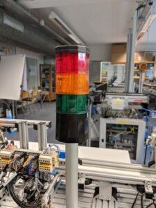
 Stack lights are found everywhere in industry. And for a good reason. They are a quick and easy way to visualize the status of a machine, which otherwise would need some effort to see. They are—sort of—a mini-andon. While sometimes underappreciated, they do serve a valuable purpose in the factory, and they usually do a good job. Let’s have a look at stack lights!
Visualization
How to See Visual Management
 Yet another hot topic in lean manufacturing is visual management. This can be very helpful in running a shop floor, but when done wrong it can also be quite wasteful and embarrassing. In this post I would like to show you the basic principles of visual management with a few examples. There is more to visual management than merely putting lines on the shop floor.
How to Use an Andon – and How Not To
 In my last post, All About Andon, I detailed how the mechanical side of an Andon signaling system works, including Andon cords, buttons, and boards. In the Western world, the mechanical side of an Andon system usually works pretty well. However, in most cases, the usage of the Andon is poor to nonexistent. Hence, in this post I tell you how to actually work with an Andon, and then I will give you a rant why companies so often mess it up!
All About Andon

Andons are systems to alert operators and managers about current problems in manufacturing. The system automates the information flow in case of problems. An Andon system usually consists of the actual Andon, sometimes called an Andon board. Often, additional input and output devices are possible, the most famous being probably the Andon line, a cord that can be pulled to alert others about a problem. In a second post I will talk about How to Use an Andon – and How Not To.
All About Swim Lane Diagrams

In my previous posts I described the details of value stream mapping. However, value stream mapping works only for highly linear material and information flows. Unfortunately, many industry processes, especially in administrative or indirect areas, are all but highly linear. To visualize these processes, a new diagram was developed – the swim lane diagram. In this post I will show you how swim lane diagrams work.
All About Spaghetti Diagrams

A spaghetti diagram is a quick and easy way to track distances of parts and people on the shop floor. The name comes from the result looking like a plate of spaghetti. In this post I will explain the details and give some tips and tricks on how to make a good spaghetti diagram.
Practical Tips for Value Stream Mapping
 After discussing when to do value stream maps, the symbols, and the basics of value stream mapping, I want to give some more practical tips for value stream mapping. What tools should you use? Do you use a computer (yuck) or a pen and paper (yup)? I’ll also summarize some generally helpful hints in drawing a value stream.
Basics of Value Stream Maps
 Knowing the symbols for value stream mapping is only a first step. This is like the difference between knowing the alphabet and writing good stories. There are much more things to consider for generating a good value stream. In this post I will go through the basics of drawing value stream maps. I found it surprising how much detail there is to what in literature is often simply abbreviated to “go out and draw it.”