
 After discussing when to do value stream maps, the symbols, and the basics of value stream mapping, I want to give some more practical tips for value stream mapping. What tools should you use? Do you use a computer (yuck) or a pen and paper (yup)? I’ll also summarize some generally helpful hints in drawing a value stream.
Options for Drawing a Value Stream
There are different methods for drawing a value stream. I don’t mean the gathering of information (see Basics of Drawing Value Stream Maps), but how to put it on paper.
Use Pencil and Paper
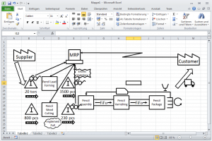
This is by far my most preferred method. It is quick, easy, and can be changed using a simple eraser. As for paper, I usually go for an A3-sized paper. In the United States this would be called tabloid or ledger and measure around 11 x 17 inches. It is big enough to fit the relevant data of a value stream, yet still small enough to be carried around on the shop floor.
Pre-Printed Cards on Pin board
Another option I have seen and used are pre-printed cards. You have cards with all relevant value stream mapping symbols, and pin these to a pin board.
While pre-printed cards may appeal to a sense of order, I personally don’t like them much. Generally, with such cards, we were usually running out of some symbols (usually the unstructured stock triangle – yes, I know, lots of potential there) while having way more than necessary other symbols (customers, suppliers, trucks …).
You can draw on the pin board if you put a large sheet of paper over it beforehand, so that would work. This way you can easily add information flows. However, I once observed others who added the information flows using wool yarn and pins. While it looked nice, it was a lot of work to add, and even more to change. Definitely not recommended.
Finally, it is more difficult to bring a pin board along in the factory, hence it gives a tendency to a conference room value stream with all its disadvantages.
Pre-Printed Post-its or Magnetic Cards
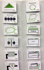
Another alternative that I liked more (but still less than pen and paper) were cards that could be stuck on a whiteboard. I worked with magnetic cards and have seen Post-it style cards.
Both are doable. They still have the disadvantage that you will run out of “popular” cards and have to lug around a mobile whiteboard (if you have one) or be stuck in a conference room altogether (if you don’t have a mobile board).
The advantage here is that you can draw information flows and other details easily on a whiteboard. Even more importantly, it is easy to change. The lines can be erased, and the magnetic or Post-it stickers can be moved quickly. Still, pen and paper is best.
PowerPoint or Excel or Visio
Probably the most common but unfortunately (in my view) the worst way to do a value stream is in PowerPoint (really bad) or Excel (even worse than PowerPoint! Shudder!). Visio is actually designed for such tasks, and hence is slightly better, but still in my view inferior to pen and paper. It makes everything more difficult. You can’t really do teamwork, hence you are limited to one guy with the computer and ignore the others. Taking a laptop on the shop floor is possible, but not really for drawing diagrams. To use a computer (even a laptop) to draw value stream maps, you need a desk and a mouse. Otherwise, it will be an exercise in balancing eggs on your head.
You spend a lot of time fiddling with the program rather than problem solving. Do not underestimate the effort needed to make a simple VSM on a computer. If you doubt it, just make a competition. Give two people the same simple value stream to map , one by hand on paper and the other using a computer. Even if the computer user is skilled and has done these before, he will take longer than a beginner with pen and paper.
Pretty much the only advantages of a computer version are a cleaner and more organized look, and the ability to share it easier with others online. However, while this means that lots of people can look at it, it will be mostly people who either don’t care or don’t understand and in any case cannot give any useful feedback. It is in effect a wallpaper that looks pretty and impresses people (although those things still can make or break a career). In case you still want to use PowerPoint or Excel, I have you a PowerPoint file with an overview of VSM symbols.
Common Pitfalls
Too Much Detail
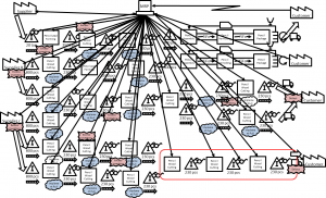
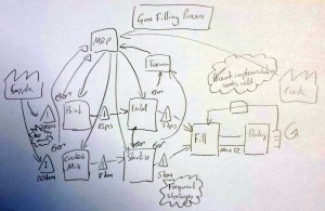
A common mistake is trying to add too much detail into the value stream. While you may believe that more information is better, the bottleneck is your ability to keep on top of it all. Too many details may confuse things more than they clarify them. Personally, I think the sweet spot is between 4 and 15 process boxes. Hence, I try to keep my number of process boxes on a value stream map below15. Anything above 30 is a waste of time. Another option is to limit yourself to one sheet of A3 paper. If you cannot fit it on one sheet, then it is too much. I once made the mistake of doing a value stream map with over 60 process boxes, but nothing useful came ever out of this.
Hence, try to focus on the processes and parts that are relevant, and do not try to make a complete encyclopedia of everything that goes on on the shop floor. You will only waste a lot of time on something that you cannot possibly fit on one piece of paper.
Designing Processes Where More than One Information Flow Ends
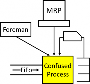
Having more than one information flow going into a process makes the work for the process confusing. Which information is valid? Both? Which is most important? Sooner or later the process will be selecting the wrong choice, hence try to have only one information flow per process. Please remember that a FiFo lane also doubles as an information flow (i.e., the process simply makes the next part in line).
Do not use more than one information flow going to a process! This will increase confusion and is again a sign of a badly designed value stream. If a process has a choice between different production signals, they will sooner or later produce the wrong thing. The signal for each process must be clear and unique!
Information Flow Ending Not in a Process But in Inventory
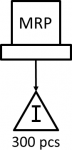
A common beginner’s mistake is to end an information flow at an inventory. However, an inventory is a passive element. It cannot do anything with information. Information has to go to a manufacturing process, data processing, the supplier, customer, or to a logistics or transport element. Hence, make sure that an information flow always ends at an element that can process the information!
Confusing Layout and Value Stream Mapping
A layout tells you where things are. A value stream map tells you the sequence of material and information flow. Hence, a value stream map usually has no relation to the physical layout, but only shows the sequence. By convention, the material usually flows from left to right, whereas (most of) the information flows from right to left, although there may be exceptions for special circumstances.
Draw the Current State without Going to the Shop Floor

The current state should represent the current state on the shop floor! Hence, to draw it you need to go to the shop floor. Do not make the mistake of drawing it in an office or meeting room. Of course, you will end up with a value stream map, but this map is how it should be and not how it is.
If you want to believe that everything is going according to plan, then that would be fine. My experience is, however, that it is rarely going according to plan. Yet exactly these deviations from the idealized standard are the things you want to know!
A similar result can happen if you merely ask different employees about the value stream but do not verify it on the shop floor yourself. Again, you will get the ideal state the value stream should be, not the real situation on the shop floor.
This is the last post on my series on value stream mapping, with the others being When to Do Value Stream Maps (and When Not!), Overview of Value Stream Mapping Symbols, and Basics of Value Stream Maps. I hope the above hints and suggestions were helpful for you in your daily work. If you have more, let me know in the comments. Otherwise, go out and organize your industry!
Very good tips. The last one is so true , but many only make the vsm in a conference room.
Yes. A lot of lean projects would work better if the people would go out on the shop floor more …
I usually do my VSMs in Excel very successfully. I use a vertical flow chart with swim lanes and I can then add all pertinent data for each process step in different columns.
I use a projector while building the VSM so all can participate. When we finish a session we distribute the VSM to all those who were not present to make sure we are reflecting the reality. They can feedback their comments changing the sequence or adding some steps we forgot, etc.
You can see an example in http://www.polyhedrika.com/freesoft.htm downloading the file Repair_VSM_and_Simulation.xlsm
Hi Cornelio, maybe it is one of my pet peeves, but I think while excel is great for numbers, it is ill suited for graphics. Nevertheless, I see many people use excel for creating value stream maps, A3’s etc. In any case, if it works for you, go for it. Thanks for commenting 🙂
My sensei sayed: “Every time you use the eraser – you’ve learned something new.”
The Japanese sure have a knack for expressing simple truths 🙂
Hi Christoph, great post with a lot of useful tips. I myself am the owner of the company SIEBEN – The Lean Expert Company (www.sieben-consulting.de), who sells the post it vsm symbols for creating value streams for adminsitration and production settings.
I agree with your argument that you are bound to a conference room, unless you have a mobile board. However the fact of running out of popular symbols is quite unrealistic, since each vsm symbol contains a number of 50 post it stickers plus we offer blanks that you can design by yourself should you run out.
But as everyone knows preparation is everything, so if you forget to restock, then…
By the way, if you are interested in testing, please drop me an email.
Hi Martin, thanks for the compliments. Yet, in lean, the more variants you have (different post its), the more likely you are to run out of parts. In any case, for pre-printed cards I like the paper version similar to your products best.
Cheers,
Chris
Chris, we have developed a hybrid of this model in a several ways that seem to help.
1. After walking the value stream or as part of it, we use cutouts with data blocks that we use on static cling sheets (smart sheets) to create the maps. Easy to move around and we encourage filling in data values with black markers
2. We have integrated Visio and Excel (into our software, eVSM)and take a picture of the wall map wth a smartphone and “trace” over it to capture it. Our trace shapes are drag & drop and correspond to the cutouts. Most of the related calculations and charts are then automatic (CT/TT chart, Resource balance chart, Lead time, VA/NVA etc..).
3. We print the captured map with the visuals and then engage the group again in brainstorming opportunities and prioritizing them
4. We can create one or more future state maps by copying and modifying the current state map. Easy to do what-if studies.
I think we are able to get a lot more value from the group involved in the event (hopefully those involved in the value stream, itself) because the calculations and visuals are very helpful in knowing where to focus. The “what-ifs” are useful in trying out things.
I have done the above in plants for discrete parts, for food processing and for chemicals. Also for transactional processes and for patient flow. Within plants, warehouses and for logistics. The variables and calculations involved are different to really see the waste and force fitting the general manufacturing terms into the different value stream types turns people off the method, I find so we tailor for each type.
I have also run the software against the hand value stream creation test. I am a power user, of course so its not a fair comparison. If we are just drawing without too much data its quite even. If we are doing calculations or creating any of the charts, its probably a 5x productivity gain for the software. This is unimportant however compared to the improved service provided to the group trying to visualize and improve the value stream.
Just to make sure, there is full disclosure. This is an area where I have spent the last 15 years trying to provide software (eVSM) to serve lean practitioners and lean deployments.
Thanks for the recent blogs on line balancing. Very nice 🙂
Best Regards,
Dilesh
VSM data found in walking around and noting what people tell you as to counts in inventory or rates thru tools can be verified with MES or other reporting systems but don’t challenge either source before you fully understand the way data is entered or not and what is only entered as aggragated rather than raw data.
Raw data sample examples can be plotted on shop floor on paper multi -vari graphs to get multi shift inputs and context notes added.
That puts vsm wip data in context with quality checks.