
 In my series of posts on the Toyota KPI dashboard I went into detail about the different sections and KPIs. These dashboards work well fro Toyota. However, this does not mean that they automatically work well for you too. Chances are, you are not making cars. Even if you are, your relevant KPI information may be different from Toyota’s. Let’s have a look…
Introduction
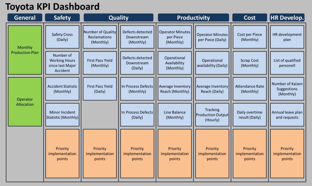
In my last series on the Toyota KPI dashboard I went in great detail about the dashboard. At Toyota, it always seems to have the KPI sections safety, quality, productivity, and cost, in that order. Additionally, there is usually a section on people (HR), a general production plan and operator allocation, and quite a few problem-solving activities. Below is the summary example dashboard.
What You Should Copy
 I believe the top-level structure of Toyota is quite good, and I think most companies can copy this. Hence, you should have KPIs on safety, quality, productivity, and cost. And, unless you have a good reason to do otherwise, they should probably be in that sequence of priority. Of course, you can rename them as needed. For example, if your company or your section does not actually make products, you can adapt the name “productivity” as needed. In logistics, for example, this could be “delivery” or “shipments.”
You should also include some sort of improvement activities in the dashboard. This is often the trickiest part, as some activities can be implemented quickly while others languish on the dashboard for an eternity.
What You Should Adapt
 While the headers are pretty much set, you have a lot of flexibility on what kind of KPI to put into the dashboard. It should be something relevant to the section for which the KPI board is set up, and measurable. If possible, also include the targets for the KPIs.For each KPI you should also consider the frequency of measure. This can range from hourly (e.g., Toyota production quantity) to daily, monthly, or even yearly.
The “relevant” part is important, as it should be relevant to the section in the company that discusses this dashboard. The section should be able to actively influence the KPI. Product quality is less important in outbound logistics. Delivery performance is less important to production. A measure on the return on investment (ROI) may make sense for top executives but not for the shop floor team leaders.
Yet, delivery performance is important. A couple of readers asked me why my series on the Toyota KPI dashboard did not include any kind of delivery performance. The example I used did not, since it was a production department dashboard, and for them it is important to make the quantity, which includes the right product type. From there, it is handed to logistics and delivered to other Toyota plants or dealers. Logistics may as well have delivery performance, but the shop floor itself has little influence on delivery performance as long as they make the right products (quantity, quality, type).
The “measurable” part is important, as you should get values that can be measured reliably and accurately. The softer your numbers are, or the more you can fudge your numbers, the less meaning a KPI has. Delivery performance and OEE are two examples of KPI that I find frequently fudged and manipulated (and I even wrote a sarcastic blog post on fudging your OEE). The more precise you can measure a number, the more beneficial it will be on the dashboard to represent a certain section. Unfortunately, sometimes an aspect of business is important but hard to measure. Examples include safety near misses, customer satisfaction, or quality issues in the field. All of them have a tendency to be unreported or difficult or expensive to measure.
I once saw a dashboard in an logistic office that, despite my advice on the contrary, counted the daily “Number of Emails Sent” to measure office productivity, with a bigger number of course being better. Guess what happens if your bosses measure your performance by the number of emails you send out? Exactly, email traffic will increase (because that’s what management wanted, apparently). I don’t know how it turned out, however. Management claimed beforehand that this will not cause an email inflation. The reason for the measure in the first place was that they wanted to measure office productivity, and this was the only number that they could get. Oh well…
Also feel free to adapt the improvement activities, employee assignment, meeting attendance, and other elements as needed.
Example KPI Dashboard from Niederrhein-Gold
![]() Here is an example of a KPI dashboard from a company that is quite different from Toyota. It is from Niederrhein-Gold, a German producer of juices and other beverages, and they have evolved it to fit their needs. This dashboard also has the sections productivity (“Leistung“), cost (“Kosten“), and quality (“Qualität“). Safety is part of the employee section (“Mitarbeiter“), where they also track the shift assignments. A general section (“Allgemein“) contains an agenda and an attendance list. Note that this is a picture from a conference where they presented their dashboard, not directly from the shop floor. But it contains everything that is also on the shop floor. I blurred some data for privacy purpose.
Here is an example of a KPI dashboard from a company that is quite different from Toyota. It is from Niederrhein-Gold, a German producer of juices and other beverages, and they have evolved it to fit their needs. This dashboard also has the sections productivity (“Leistung“), cost (“Kosten“), and quality (“Qualität“). Safety is part of the employee section (“Mitarbeiter“), where they also track the shift assignments. A general section (“Allgemein“) contains an agenda and an attendance list. Note that this is a picture from a conference where they presented their dashboard, not directly from the shop floor. But it contains everything that is also on the shop floor. I blurred some data for privacy purpose.
![]()
As Niederrhein-Gold does not make cars but juices, the KPI are adapted to their needs. In the performance section they track the daily quantity of products bottled (target, actual, and delta; the latter has a target tolerance interval around zero). They also track how many kilograms of apples they turned into juice every day, as well as the yield rates.
The cost section tracks deliveries and delays. In the quality section they track which days were good using a quality-Q, as well as the number of duplicate laboratory samples taken. The employee section has the familiar safety cross, the shift plan, and the number of people in the different production departments. In the general section besides some meeting guidelines they track the attendance for the shop floor meeting.
A second section has the improvement activities, split into a daily and a weekly plan. The daily plan on the left (“24h – Aktionsliste“) includes quick and easy actions that should be done today. As it is supposed to be done on the same day, the date of entry is also the deadline. For every day delay, it gets another red star. Too many red stars, and it moves to the weekly plan (“Wochen-Aktionsliste“) for activities that take longer.
![]()
Summary
Overall, you have great freedom in selecting the KPI for your dashboard. It probably won’t be a single design, but more of an evolution of KPI parameters. Over time you may add new KPI or take out less relevant ones. Note that we have a tendency to add more but are hesitant to take some out in turn. Over time, dashboards can get crowded, making them less useful. Do not hesitate to also remove KPI from the dashboard again. Now, go out, revise your KPI dashboard, and organize your industry!
PS: Many thanks to Heike Camps from Niederrhein-Gold for sharing their approach at the Akademie Fresenius Praxistage Produktion 2023.