
 In my series on the Toyota KPI dashboard, after safety, quality, and productivity, we finally arrive at cost. While for some companies it is the number one factor, for Toyota it is far behind safety, quality, and productivity. The argument is that if safety, quality, and productivity are in line, it is likely that cost is also good. Both a lack of quality and a lack of productivity will drive up the cost.
Introduction
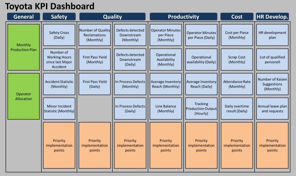
The factor cost on a Toyota shop floor is measured as a cost per piece. Additional KPIs are the scrap cost, the attendance rate, and daily overtime. And, looking at this with a critical eye, it seems a bit like a mixed bag. For the Toyota example I have, it feels like they just put things there simply because there was space left. The scrap cost would also fit very well in quality. The attendance rate also would fit well in the HR section (which is not quite a KPI, but still part of the dashboard example I had). Overtime could also fit into productivity or even into the HR section. But these are just my two cents, and maybe I just don’t understand some Toyota wisdom behind it. Or, it merely underscores again that cost is the least important KPI group. In any case, it may be not so important where the KPI is, and more important if the KPI is there at all. As always, don’t just copy whatever Toyota does, but make your own informed decision!
Cost per Piece
The main measurement for cost on the Toyota dashboard example I have available is the cost per piece. And this opens a whole can of worms on how to calculate the cost. Do you use labor cost only, or also the materials? Do you include the cost of the machines too? Is there an overhead for management and other services? This could be anything from production cost to the total cost of the piece. Depending on the type of cost, this could include many assumptions and estimations, opening the doors to all kinds of number fudging or wrong conclusions (e.g., the wrong way to decide make-or-buy). And, honestly, I don’t know the full details here at Toyota.
However, since this is a KPI for a shop floor dashboard, it would make sense to me to use a metric that shows as much as possible on the shop floor performance, and as little as possible on other factory. On the other hand, the labor cost alone is already represented well by the operator minutes per piece, and having a separate labor cost would only be redundant (and we should avoid redundant KPI). In any case, the cost per piece is a chart on a monthly basis as shown below, including a target (all KPI should have a target).

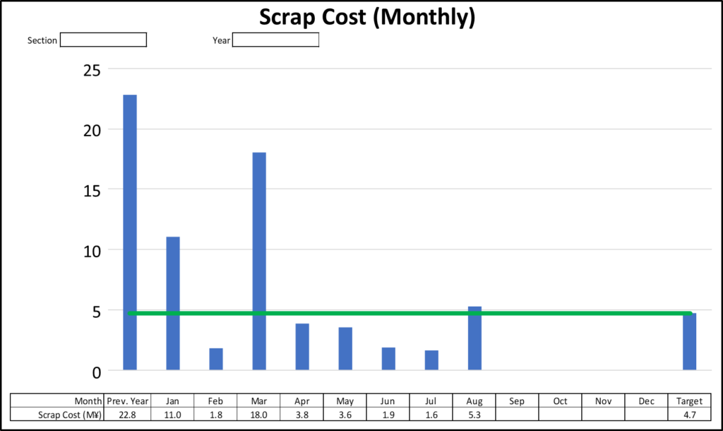
Scrap Cost
Similarly, there is a sheet for the monthly scrap cost. Below is an example, and—as all examples here—with fictional data. As mentioned above, this could also be seen as part of the quality KPI group.
Attendance Rate
The attendance rate shows the percentage of workers who are on-site based on the percentage of workers who should be on-site. The inverse is the absentee rate. Since it is easier to read, I plotted the absentee rate even though the title of the KPI sheet is the attendance rate. In any case, either way works. Also as mentioned above, this could also be seen as an HR related topic.

Daily Overtime Results
Finally, they show the daily overtime. This is something specific to Toyota and may not be applicable everywhere, depending on your overtime policy. At Toyota, they can schedule overtime every day on short notice. At the UK Deeside engine plant, for example, they can scheduled overtime with as little as two hours’ notice. Standard policy at Toyota is to make the daily quantity, and use overtime if a line falls behind. This is of course beneficial for the company (as it improves the quality of the planning data regarding the daily output), but on the other hand it can be harsh on the employees. At Deeside, some people liked it (overtime pay) and some did not (difficulty of planing personal time for the benefit of the company).
Below is an example on how such a chart could look like, also including fictional data. The chart also has a cumulative line.


Here is also a photo of the actual productivity and cost dashboard at the Toyota UK Deeside engine plant. The actual sheets look slightly different, again since there is not fixed standard enforced beyond the Safety—Quality—Productivity—Cost KPI groupings. This post completes the main KPI groups that are part of the Toyota KPI dashboard. However, when used for the daily shop floor meeting, there is also some additional information like a section on HR, a production plan, worker assignment, and problem solving as needed. More on these on my next posts. Now, go out, keep an eye on your costs (even though safety and quality should get more attention), and organize your industry!
PS: Many thanks to Mikako Lenquist from C2U in Sweden for organizing the Lean Leadership System in Japan 2023, where former Toyota factory manager and director in charge of TPS promotion Akinori Hyodo shared his wisdom. Most of the data in this post series I learned from this tour.
Additional thanks to the team from the Toyota Lean Management Centre at the Toyota UK Deeside engine plant in Wales, where I participated in their 5-day course. This course gave us a lot of access to the Toyota shop floor, and we spent hours on the shop floor looking at processes. In my view, this the only generally accessible course by Toyota that gives such a level of shop floor involvement (albeit they want to open another center at the UK Burnaston final assembly plant).
Both the C2U Lean Leadership System course as well as the Toyota Lean Management Centre 5-day course are highly recommended!
We must always remember; Dash boards are historic records.
The key to real control is at the action stage of the activities that generate the data that appears on our dashboards.
Standard work is a key element of this control.
It specifies. For any given workplace.
Work sequence. Take Time. Equipment to be employed. Standard WIP. Number of operators.
If we add source inspection with PokeYoke devices; we now have detailed control of Quality, Cost and Delivery. In the workplace.
Within TPS these values are monitored and controlled at the place and time of their occurrence; not after the event in some remote accounts or other support departments.
Love your posts Christoph! Question: I don’t see any metrics / KPIs related to service or delivery? What are your insights on how Toyota measures, and visualizes delivery / service?
Thanks!
Hi Mike, the example I looked at did not have delivery metrics (like On Time in Full OTIF)… because they did not need them at that location. It was a shop floor, and they were concerned with making the products. Delivering does happen (and is likely to be tracked by corresponding metrics), but it was not a part of the shop floor operations.