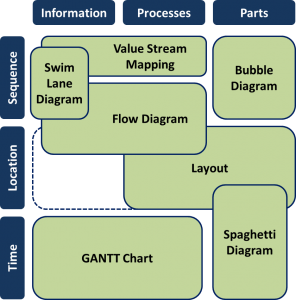
 Organizing your manufacturing system is one of the keys to success in manufacturing. There are different tools available, although I have the feeling they are often mashed together or confused. Time for a structured overview of the different manufacturing diagrams available, with recommendations. The following post does not give a full explanation on how these visualizations work. Instead, I want to give you a summary of what is out there, so you can pick the right tool to improve your system.
Different Visualizations
There is a multitude of different ways to visualize your value stream. The well-known value stream mapping is only one of many ways to structure it. Here I will give an overview of some of the options you have. Most of them have a structure according to either
- Time
- Physical location
- Sequence
or any combination thereof. Depending on what you want to achieve, some may be better than others. There is no single answer; it all depends on what problem you want to solve. All of these should be done only if they help you solve your problem. I have seen too many examples where it is done simply for the sake of doing it (in this case, don’t expect any improvement or benefit from your effort – except maybe for your career if your boss wants you to do it just because 😉 ).
Layout
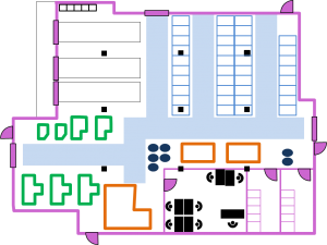 Probably the oldest and easiest way to display the structure of your value stream is a physical layout. It clearly shows which process is located where.
However, it (usually) does not show how the processes are related to each other. Nor does it show any time-wise organization. Pretty much all plants have a layout. However, if you design a value stream, the layout should be the last thing done. You need to get other structures completed before you can think about how to fit everything on your existing or future shop floor.
Bubble Diagram
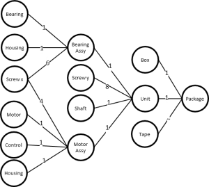 Another way you can structure your material flow is a bubble diagram. It shows you the sequence of parts needed to create your product. You simply make a bubble for each part and connect them in the order they are assembled or processed.
To make a bubble diagram, you usually start with all your parts for one product. For example, you could take all your part numbers in the different bill of materials related to one product. Then you arrange these parts and connect them with lines. Usually, you start at the left with the purchased components and work your way to the right. In most cases the parts merge, but depending on your product they may also split. Each part should exist only as a single bubble. If you need the part for more than one other component, you add more than one outgoing line to the bubble.
Importantly, a bubble diagram does not show processes, but only parts. If you are interested in the processes, a flow diagram or a value stream map may be more helpful. For more details see my post Bubble Diagrams to Visualize Material Flow
Flow Diagram
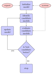 Flow diagrams have also been around for quite some time. They show the sequence of a flow of information and items. A flow chart can show only a sequence of events or processes. In this case, the flow usually starts at the top and flows toward the bottom. However, it is also possible to group related processes in the flow diagram.
Alternatively, the flow can also be represented on a layout by connecting different locations on the layout. In this case, the flow starts and ends wherever it physically starts or ends in the system.
Often, a nomenclature is used where, for example, round shapes indicate start and end points, square boxes indicate actions, diamond shaped boxes indicate decisions, etc. Six Sigma uses flow diagrams more frequently and calls them process maps.
When I am doing lean, I generally do not use flow diagrams very often. For most problems, I find a value stream map more useful. However, a value stream map is basically nothing more than a flow diagram with different symbols.
Value Stream Mapping
 A value stream map (VSM) is a structured display of the material and information flow. Usually the material flows from left to right, and the information flows in the opposite direction. The symbols most frequently used originate from the bestselling book Learning to See by Rother and Shook. They can help you understand the current state of the manufacturing system and how to design the future state.
VSMs feature very prominently in Western-style lean manufacturing. While I use this tool quite frequently, I often see it overblown and used without purpose. Many companies spend much time and effort in perfecting their current and future state value stream maps, to the point that they have no time left for actual improvement. I describe value stream mapping in more detail in my posts When to Do Value Stream Maps (and When Not!), Overview of Value Stream Mapping Symbols, Basics of Value Stream Maps, and Practical Tips for Value Stream Mapping.
Spaghetti Diagrams
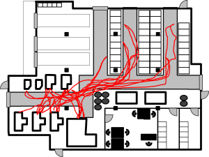 Spaghetti diagrams are a representation of the distance a person or part travels on the shop floor. You simply put a pen on a layout, and as you follow a part or person around, you let the pen wander on the layout to mark where the part or person went. The result usually looks like a bowl of spaghetti, hence the name.
For a later analysis, you estimate the total distance traveled and then see how you can reduce this distance. For more read my post on All About Spaghetti Diagrams.
Swim Lane Diagram
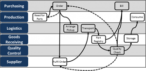 For indirect or administrative processes, a value stream map is ill suited to show the information (and sometimes material) flow. Usually, this flow is way too unstructured, iterative, parallel, and confusing.
To represent these flows, a swim lane diagram can be used. The name stems from the use of lanes similar to the lanes in a swimming pool. The name is by no means universally accepted, and this is also called “process mapping.” Naturally, it also has a Japanese name. If you want to impress others, you can call it makigami, although this simply means “a roll of paper” in Japanese.
Each lane represents one department or person or office. From left to right (less common also top to bottom) the process unfolds. Each action is written in the lane of the corresponding department. Hence, different from value stream mapping, you can quickly see how the information or parts flow between different departments. Also different from value stream mapping is that the swim lane diagram allows loops, splits, and recursions. These happen, for example, if two departments work in parallel, or if due to problems or uncertainties the job is given back to a previous step. Most real-world swim lanes have a lot of iterations in them. For more read my post on All About Swim Lane Diagrams.
Gantt Charts
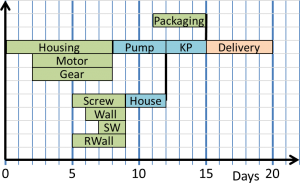 Gantt charts are named after Henry Gantt, a protégé of Taylor. However, they were also developed before by Karol Adamiecki. They were THE hop topic and a popular buzzword in 1910, although nowadays they no longer impress others 😉 . Nevertheless, they can still be enormously useful.
Gantt charts show the relations of a schedule. Each action is added as a bar on a timeline. The arrangement of the bars show which processes depend on what other preceding processes, parts, or information. It is easy to find the critical path that you have to improve in order for the entire system to improve.
An expansion of the Gantt chart is PERT, which stands for either Program Evaluation and Review Technique or Project Evaluation and Review Technique, although it is more for visualization of project management than shop floor manufacturing.
Is That All?
Oh no! There is more out there. However, most of the additional approaches are variations of the above. They may have a different name, different symbols or layouts, or come as an (expensive) software package that promises to solve all your problems (but make sure you read the fine print!).
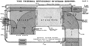
Another one may be Sankey diagrams, a type of flow diagram where the width of the connecting arrows represent the quantity flowing through (material, cost, energy). These arrows can merge into larger ones or split into smaller ones. Due to the high demand on graphic accuracy it is difficult to make by hand and usually requires software support. Named after an Irish engineer with the impressive name of Matthew Henry Phineas Riall Sankey (1853-1926), who used it to show the energy flow in a steam engine. However, it was used already earlier, e.g. by French engineer Charles Minard in 1812 showing the flow of troops of Napoleon in Russia.
There are probably even more diagrams that I don’t know (yet). For me, the above is a useful set for most manufacturing related visualizations. If I missed an important visualization, let me know.
When to Use What?

Most of these visualizations are very useful to show a certain aspect of the system. It depends if you are interested in the time, location or sequence of the information, processes, or parts to determine which approach will be most suitable.
Most of these visualizations can be done for either the current state or the future state, or even an intermediate state if necessary. They can be done for a detail of some processes (micro perspective), for a big overview (macro perspective), or anything in between, depending on your needs. Please don’t try to do a detailed visualization for the big picture, as you will get nowhere!. They can be done by hand (usually my preferred method) or by computer (probably most useful for Gantt charts and finalizing layouts).
To get an overview of a new line, I usually start with a bubble diagram. As a next step, I detail the combined information and material flow using a value stream map. Finally, a layout tells me what to put where. Spaghetti diagrams are then for optimizing existing value streams.
However, these are only a way to visualize the current or future state. These are NOT methods to determine how the future state should look. They help you to see and understand, but not to decide on what to do. For this, you need more tools out of the lean toolbox, and most importantly you need common sense.
For each of these, you can probably find people on the web telling you exactly the one single correct way to do it. Don’t believe them. Having used all of the above methods, I prefer to adapt the methods to match my problem. For example, in value stream mapping I sometimes hear that you must add the data before you can do anything with it. However, most of my value stream maps have little data in them initially. Only if I need the data do I actually invest the effort. It all depends on the problem you want to solve. In the next few posts, I will go into more detail on some of these methods. Until then, go out and organize your industry!
P.S. A Russian translation by Valery can be found here: Визуализируйте вашу систему — Обзор используемых в производстве диаграмм

Good overview. I must agree with you. In your last paragraph, you mention the statement of some people that you should enter all data before you can do anything with the value stream map. I see it like you. In more than 15 years of experience in the application of the value stream design I could very often forgo the collection of data, because the problem just was another one.
Many thanks. I am glad that others have the same experience. I will go into much more detail about VSM in the next few posts, including the “when to get data” question. Cheers, Chris
Thank you for this helpful post. Thank you so much
You’re welcome 🙂
Hi, Interesting article. I think you missed the PERT Chart or “Activity Network Diagram” as it is known as one of the Seven Management and Planning Tools or the 7 New TQC Tools defined by the JUSE to solve problems when you don’t have history (numbers). Regards
Hi Gus, thanks for pointing that out. I added a line about PERT in the article.
Quisiera agradecerte por compartir estar importantísima informacion practica y a la vez muy didactica.
Very useful insights
Thank you for this great post! Allow me one question, where can I find the source of Diagramm “Different Visualizations for different purposes”? It would be very useful for my work.
Hi Hannes, the image is my own creation, and was first published here on this blog (i.e. original research 🙂 . Hence for a source you would need to cite this blog post. You can find the full resolution of the image by clicking on the image.